How we failed and then fixed the design of Catch’n’Merge puzzle
When I was little, I loved merge games and played them daily. My favourite were suika-style puzzle games where you drop two objects, they merge into a new one and you keep going and build bigger and bigger creatures. I could play it for hours. First I just wanted to reach the last tier and then I played to get a higher and higher score.
As I got older simple drop merge puzzles started to feel a bit boring to me. Because all you really do is drop and merge, drop and merge. It is calm and nice but after a while I wanted something more.
So now when I became the person who actually makes games, I decided to make my own merge puzzle. Something with that same satisfying merging bit but with more action and dynamics. That is how Catch’n’Merge was born.
About Catch’n’Merge
As you probably already know from the previous post, Catch’n’Merge has two phases. In the first phase you have to be quick and try to catch as many falling creatures as you can and at the same time dodge the falling rocks that can break your flask. Whatever you caught in this phase will be your drop in the second phase where you drop and merge items - same as in a classic suika-style merge game. So it has a part that is relaxing and a part that is active and a little bit chaotic.
Today I don’t really want to talk about the rules and gameplay - we already have a post about it. I want to talk about how the game looks and how we got that wrong at first.
Our first look: Neon Alchemy Lab
When we started, we went with a dark theme and called the game Neon Alchemy Lab. It had a black background, glowing neon lines, a kind of neo-futuristic science lab at night. We really liked it and honestly, I still do like it.
Fall stage in the original design.
Merge stage in the original design.
Player feedback: creatures and UI didn’t match
But when people started trying out the game, a lot of them did not like the dark look. The feedback was almost always the same - players told us that the creatures in the game are bright, cheerful and a bit silly, didn’t match with the dark and mysterious surroundings. One player said that the happy creatures and the dark lab felt like they came from two different games.
Once enough people pointed it out, we could not unsee this mismatch. We decided to make a change, but now we had two options - to change creatures or to change the overall game design. And we decided to keep creatures because they look cute and almost everyone who tried the game loved them.
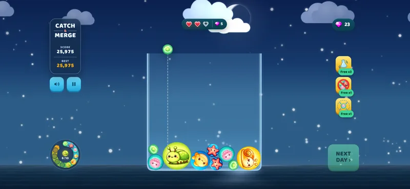
The new look: open sky, day and night
So we changed everything else. Instead of a dark lab we put the game under an open sky with the sea in the background. The two phases of the game became day and night. The fast phase where you catch the falling creatures, now happens under a bright daytime sky with a sun moving through the horizon. The calm half, where you drop and merge creatures that you caught in the flask, happens at night under the Moon and the stars.
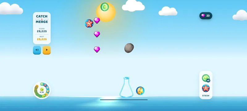
Fall stage - new design.
Merge stage - new design.
Thoughts of the team
We think the new design fits the creatures much better. The busy catching feels like daytime and the merging matches with the relaxing evening. Even though we initially did not plan it that way, we really like how it turned out.
Unpredictable turns like this one is a very interesting aspect of making games. You can love your own idea and at the same time be wrong about it. Because the only one who can validate game ideas is the player who looks at the game with fresh eyes. And we were just lucky to receive their feedback on time and act on it.
If you like merge game puzzles but you want a bit more action than just merging, give Catch’n’Merge a try in your browser for free. And if you have an opinion on how the old dark theme looks versus the new bright one, or want to share literally anything else game-related, please tell us in our Discord. We would love to hear your feedback, who knows, maybe it will change one of our future games.
Written by
Ana